Rennicks:
Identity Design, Visual Language and Brand Guidelines
Rennicks think outside the box and provide creative and sustainable solutions for their clients’ traffic signs and road technology challenges. They keep road users safe, secure and informed. They channel that purpose, fosters innovation, that in turn provokes discovery whilst having an impact nationally and internationally providing unmatched levels of quality, service and expertise.
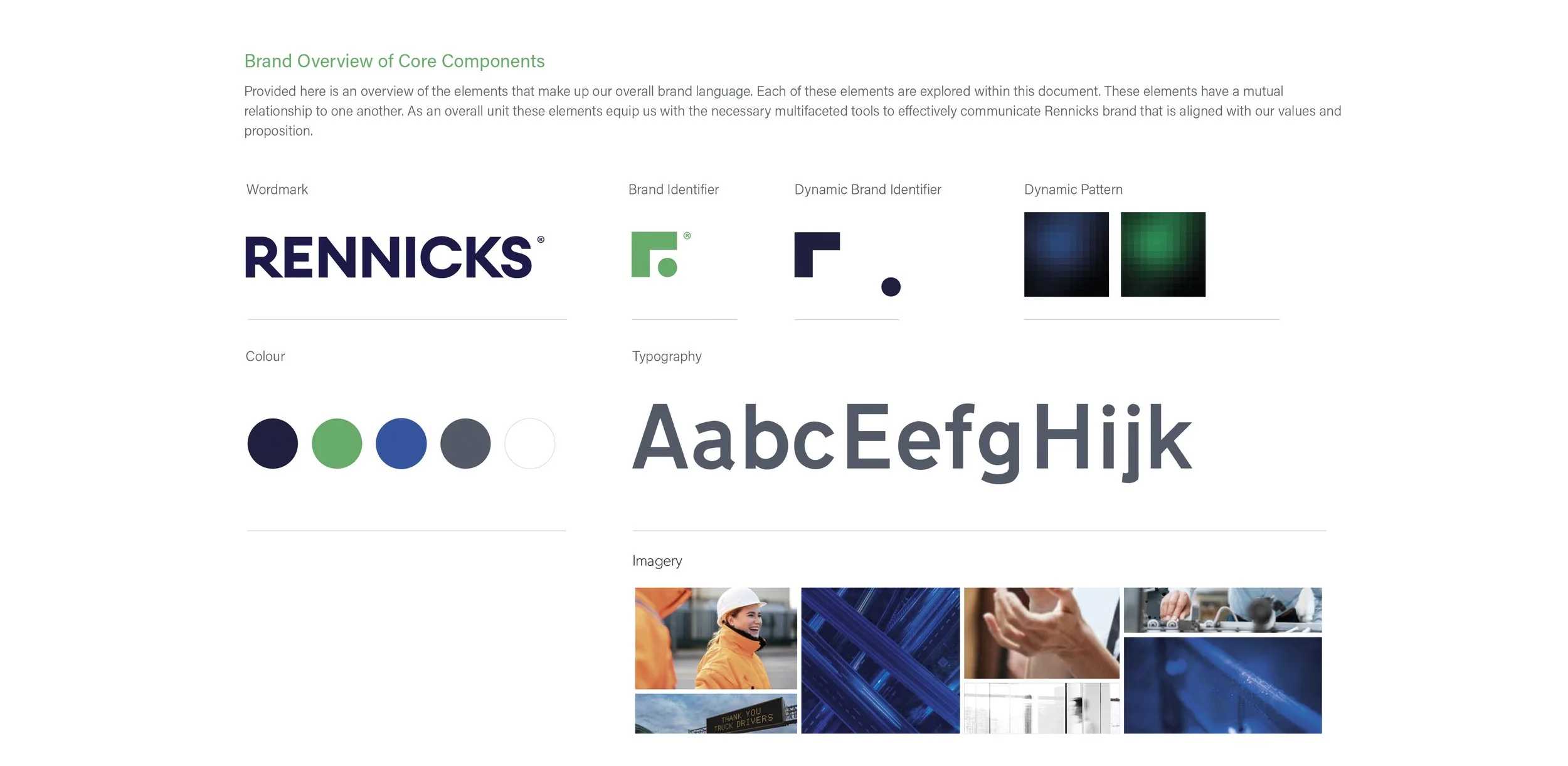
The visual identity and language encompasses this essence of their organisation.
Along with brand assets a brandmark was created as a signet. It is shorthand that represent these elements. The brandmark is an expressive brand symbol that embodies their partnership spirit.
The new green and blue is a straightforward approach derived from the history of road signage. The new palette creates a bold allure that engages with immediacy. Its a palette that is bold, compelling and unexpected in its confidence and directness. Signifying the original functionality and rationale to the old design system for public roads.


